Infusing marketing data into your campaign is a no-brainer.
According to LinkedIn, data-driven companies outperform their competitors by up to 20% in almost every metric.
And when it comes to gaining actionable insights from data and putting it to use in a digital marketing campaign, it starts with a marketing analytics dashboard.
What Is a Marketing Analytics Dashboard?
Simply put, it’s a tool that condenses all your marketing analytics data into one place so you can evaluate and monitor campaign performance.
A marketing dashboard provides a visual overview of KPIs and metrics, breaking them down into charts, graphs, maps, and so on so you can understand them at a glance.
Here’s an example of what a PPC dashboard might look like, which covers ad cost, clicks, impressions, click-through rate, cost-per-click, conversion rate, and more.
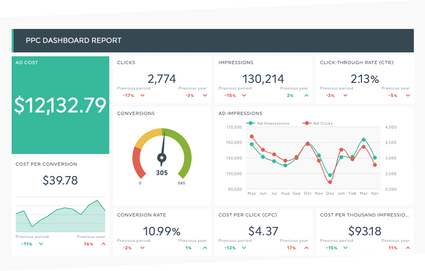
Source: Referral Candy
A marketing performance dashboard is important because it helps a marketing team quickly grasp patterns and trends, giving them a bird’s-eye view of what may be difficult to digest otherwise.
And dashboard software can be incredibly comprehensive. Everything from paid advertising to SEO to blog engagement to email engagement and beyond can be effectively analyzed and understood without having to meticulously sift through mountains of marketing data.
Instead, an analytics dashboard displays key marketing metrics in a centralized location so you can conveniently gather the insights needed to understand marketing activity and make better decisions.
In turn, you can use the data to optimize your marketing strategy, improve the customer journey, increase conversions, boost customer loyalty, maximize your ROI, and more.
But to efficiently display your data, you first need a marketing dashboard.
Metrics You Should Track on Your Marketing Analytics Dashboard
Let us start by saying there are multiple types of marketing analytics, and there is no one-size-fits-all formula for marketing reporting.
The specific metrics tracked will vary for different marketers. Further, the digital marketing metrics your company tracks will likely change over time.
With that being said, there are some essential metrics that nearly all brands can benefit from tracking across the board with their marketing analytics dashboards.
Those include:
- Traffic by channel
- Page views
- Bounce rate
- Average session duration
- Landing page performance
- Top-performing keywords
- Top-performing blog posts
- Top-performing social media posts
- Social media engagement
- Overall lead volume
- Marketing qualified leads (MQLs)
- Sales qualified leads (SQLs)
- Click-through rate
- Cost-per-click
- Cost-per-lead
- Cost of customer acquisition
- ROI by channel
And because choosing which specific metrics to track in your marketing campaign can, admittedly, be a little overwhelming, we suggest asking the following questions to help you decide.
- Which metrics are most essential to creating a smooth sales funnel and seamless customer journey?
- Which specific behaviors and forms of engagement are we most interested in learning about?
- What types of patterns and trends do we want to understand?
- Which areas are we currently struggling in with our campaign? (For example, maybe your Google Ads or social media posts haven’t been getting a sufficient ROI.)
Also, note that you likely won’t be able to track every single metric to its full potential right out of the gate. Therefore, you’ll want to prioritize which metrics are most important to your digital marketing campaign and focus on those in your marketing dashboard initially.
Then, as you get a grasp of those core metrics, you can then branch out to others over time.
How to Create a Marketing Analytics Dashboard
First, you’ll need to choose your marketing KPIs based on the metrics listed above. As we mentioned, there are a wide variety of metrics that can be used by marketers to measure campaign performance.
But you’ll want to narrow it down to the KPIs that are most crucial to helping you meet your specific goals.
If, for instance, one of your main goals at the moment is to optimize your blog content creation, some of your KPIs in a digital marketing dashboard may be:
- Traffic by each blog post
- Traffic source
- Page views
- Bounce rate
- Average session duration
- Blog post performance
- Top-performing keywords
- Top-performing blog posts
- Exit page
- ROI
Next, you’ll need to choose a dashboard software that allows you to generate and store your marketing activity data.
One of the most widely used platforms is the Google Analytics Dashboard, which can give you a solid baseline reading of numerous KPIs.
Here’s a simple example of a Google Analytics dashboard that covers web traffic, including active visitors, bounces, average visit duration, traffic type, and device.
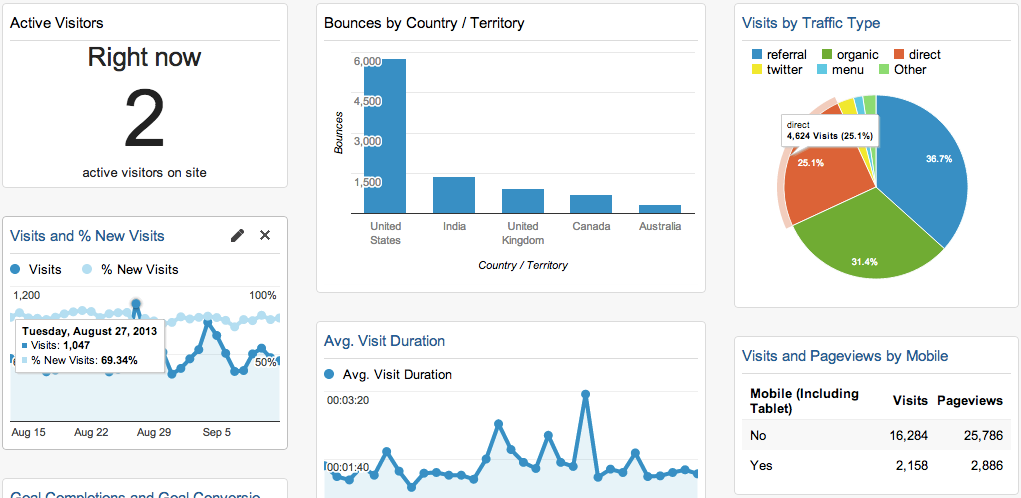
Image: Neil Patel
While Google Analytics isn’t as comprehensive as some other platforms, it can be a good starting point for many marketers.
If you want something more comprehensive, a platform like Woopra offers end-to-end customer journey analytics that can show you every single touchpoint in the customer journey for a holistic overview of marketing performance.
End-to-End Customer Journey Analytics Tool
Acquire and retain more customers with advanced analytics. Woopra is your single source of truth for tracking your customers.
Third, you’ll want to connect your dashboard software to data sources, such as your website, Google Ads, social media accounts, email marketing software, Google Sheets, Google Search Console, or anything else that’s integral to generating data for your marketing report.
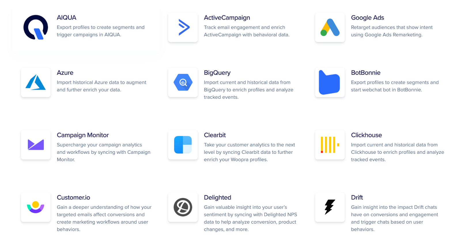
Woopra currently offers over 50 integrations with popular platforms that make connecting to a marketing KPI dashboard simple.
Here are just a few integrations on the list.
From there, it’s just a matter of generating visuals with the marketing dashboard and sharing the information with your marketing team.
Note that like many other aspects of marketing, creating an analytics dashboard is a largely iterative process that will evolve over time.
As you generate more marketing data and get feedback from your team, you can make the necessary adjustments to optimize your dashboards and improve marketing performance.
So don’t worry about getting it perfect right away. Refining your dashboards is something that will happen organically.
Just get started.
Marketing Dashboard Examples & Templates
Paid Advertising
This template displays the marketing performance of your paid ads through platforms like Google Ads, Microsoft Ads, Facebook Ads, and so on.
Some common metrics to focus on for paid advertising include:
- Impressions
- Click-through rate
- Number of clicks
- Cost-per-click
- Conversion rate
- Cost-per conversion
Here’s an example of a paid advertising dashboard that looks at how many users were converted from Google Ads.
More specifically, it shows a breakdown of the percentage of users that made it from the landing page to the pricing page to the signup page and that ultimately converted.
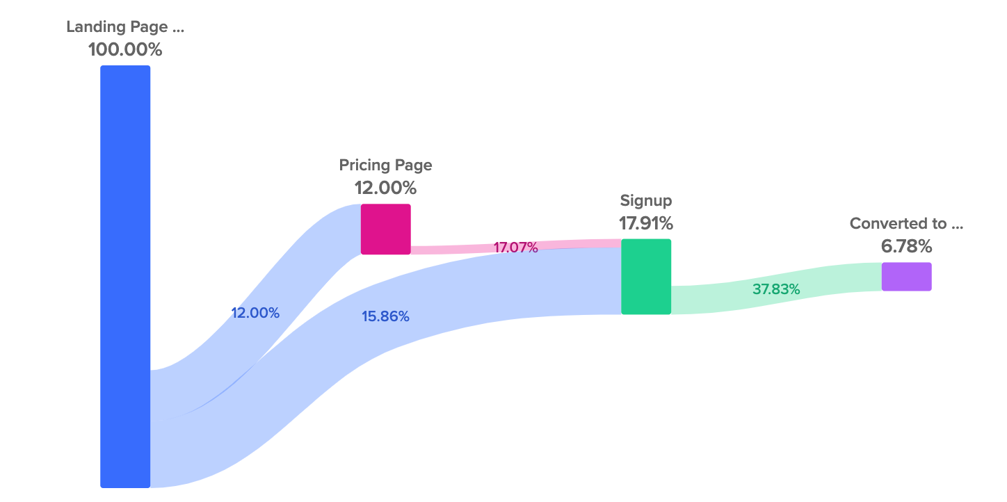
Having this type of insight is helpful because it lets you know if a healthy number of users are converting and if there are any potential points of friction throughout the customer journey.
So if you determine that a smaller-than-average percentage of leads are making it from your landing page to your pricing page, it would likely mean that your pricing page needs some attention.
In that case, you may want to experiment with the landing page structure, images, copywriting, and so on, and perform testing until you reach a healthier number.
Blog Engagement
If blogging is one of your primary marketing strategies, a blog engagement dashboard is a must.
According to HubSpot, some of the most important blog engagement metrics are:
- Organic search impressions
- Organic clicks
- Click-through rate
- Total views
- Individual blog post performance
- Traffic referral source
- Inbound links
- Time on page
- Bounce rate
- Social shares and comments
- Subscriber count
- CTA click-through rate
- Number of leads
- Goal conversion rate
- Lead-to-customer conversion rate
If, for example, you wanted to see how blog engagement impacted free trial signups, you could use a marketing dashboard to track the process of users arriving on the landing page and reading a blog post to signing up for a free trial and, ultimately, making a purchase.
Here’s what that dashboard may look like.
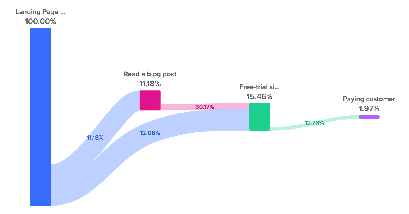
By generating this information in your data studio, you could pinpoint specific ways to increase the number of blog readers that sign up for a free trial.
If, for example, there was a particular topic or style of post that led to a large number of readers signing up for a free trial, you could double down on that type of content.
SEO Dashboard
SEO is one of the more multi-faceted marketing strategies, which means there’s a lot that can be measured on an SEO analytics dashboard.
Some good starting points can include the number of sessions from organic search, traffic source, pages per session, number of conversions, conversion rate, and overall revenue.
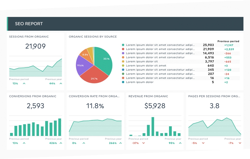
Image: ReferralCandy
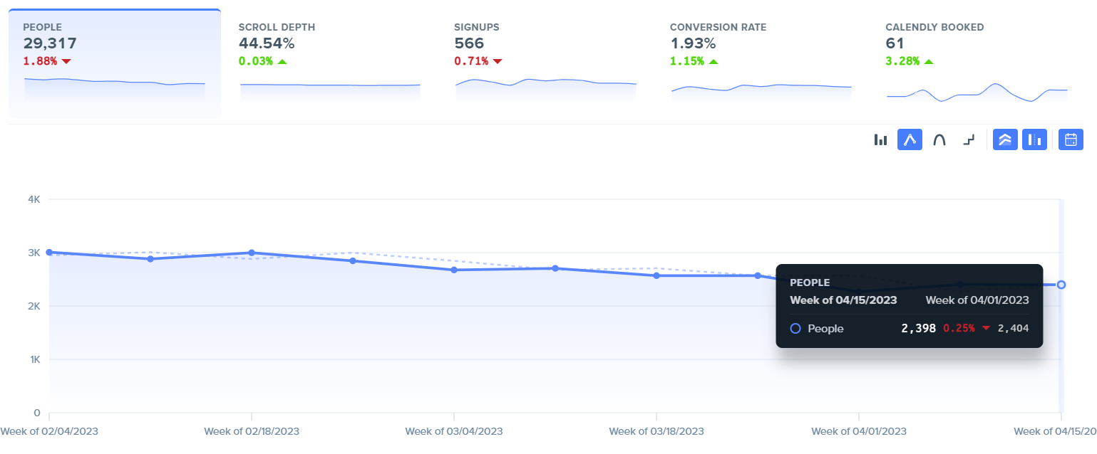
To go a bit more granular, some other examples can be looking at organic search traffic from a particular time period like the past 12 weeks.
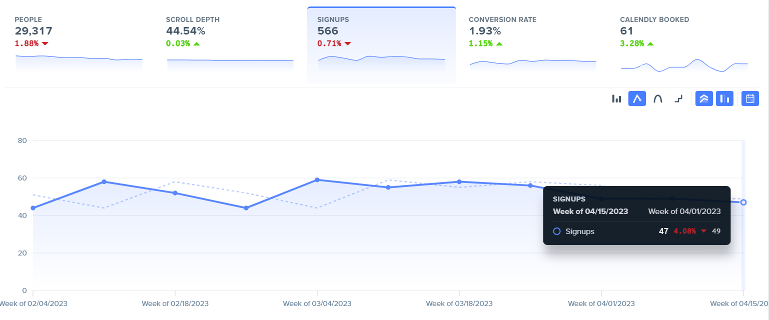
You could also see how many organic search conversions occurred during the past 12 weeks.
Besides that, there are also head term keywords, which can show you where your most important keywords are ranking, what the search volume is, how much traffic they’re getting, whether they’re trending up or down, and more.
Here’s a keyword tracking example:
![]()
As you can see, this dashboard gives us a clear overview of those keywords so we can instantly understand them with just a glance.
There’s also a graph of keywords over time, which can give marketers a comprehensive overview of SEO patterns and trends.
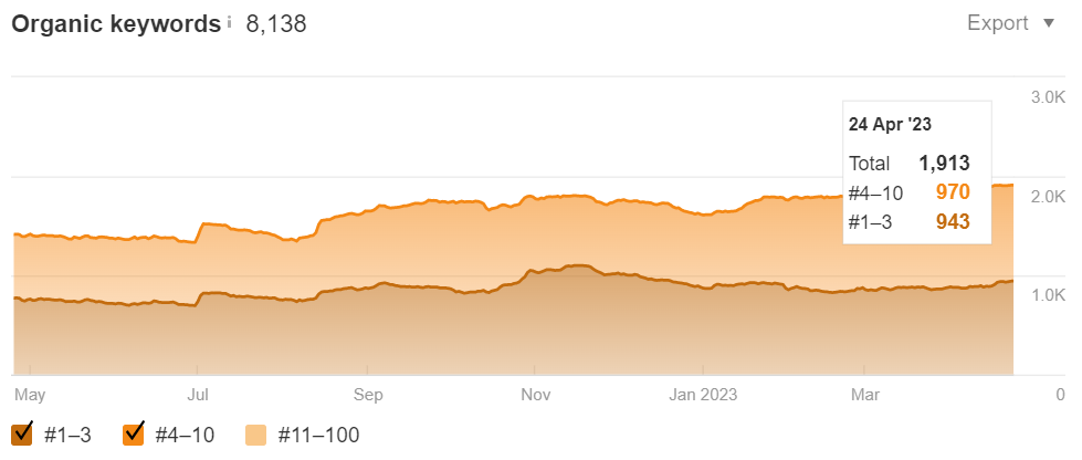
In turn, you’ll be better able to capitalize on opportunities like topics your audience is responding to and should be able to increase your conversion rate and ROI.
If SEO is a big part of your digital marketing campaign, as it is for many brands, you’ll want to use a comprehensive SEO dashboard to provide insights on all the critical KPIs.
Doing so should help you fine-tune your campaign and ensure you only go after keywords with the potential for a big payoff.
Social Media Dashboard
While social media doesn’t have as high of an ROI as some other channels such as SEO, email, and PPC, it still has a respectable ROI where, on average, marketers earn $2.80 for every dollar spent.
To get the most from your social media campaign, you’ll want to measure the right metrics — some of which can include:
- Reach
- Impressions
- Cost per 1,000 impressions
- Click-through rate
- Audience engagement rate
- Growth rate
- Comments, likes, views, etc.
- Virality rate
- Social sentiment
Here’s an example of a simple social media dashboard template that covers the basics.
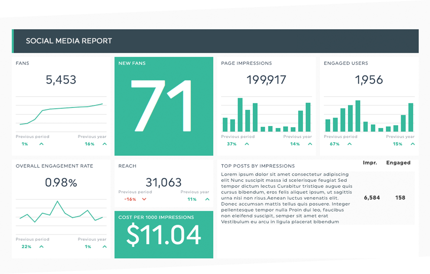
Image: ReferralCandy
While this dashboard doesn’t necessarily tell the whole picture, it helps get a baseline reading. And remember, you can always analyze more metrics later on.
After running reports for a while and experimenting with different marketing metric options, you should be able to determine which networks are having the biggest impact and how to best grow your social media presence to get the most from your money.
Email Marketing Dashboard
With most companies earning $36 for every dollar spent on email marketing and those in certain industries like retail and e-commerce earning a staggering $45, this is a marketing channel you definitely want to optimize.
In terms of email metrics, some of the most essential include:
- Open rate
- Click-through rate
- Bounce rate
- Conversion rate
- ROI
Beyond that, it’s also helpful to look at email sharing and forwarding, unsubscribe rate, and overall subscriber growth.
Here’s an example of an email marketing dashboard that covers most of the fundamentals.
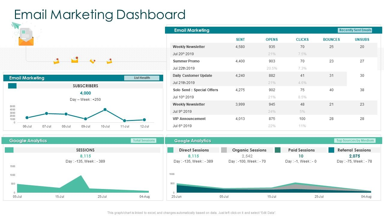
Image: SlideTeam
You could certainly go more granular, but this is a good starting point for determining which emails are performing the best and getting a sense of overall subscriber list growth.
With this information alone, you should know which types of email subscribers respond the best to better guide your future strategy.
Retargeting Dashboard
Although retargeting isn’t a strategy in every marketer’s game plan, a significant number of companies use it in some capacity.
In terms of purpose, research has found “70% of marketers use retargeting for brand awareness, 60% for social engagement, and 58% for customer retention.”
If retargeting is something you’re spending money on, you’ll definitely want to use dashboard software to measure the results.
Some specific metrics to analyze can include:
- Cart abandonment rate
- Unique visitors
- Returning visitors
- Page views
- Time spent on site
And if you’re using email as a means of outreach with retargeting, as is common with many marketers, you’ll also want to look at email open rate, click-through rate, and conversion rate to see how effective it is.
For a bird’s-eye view of how well a retargeting campaign is going, you could use a marketing dashboard template like this that shows how many retargeted visitors sign up for a free trial and end up buying.
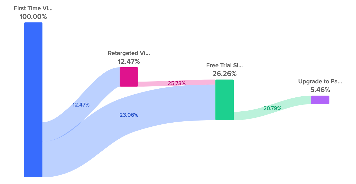
That would be an excellent starting point, and you could compare that data with the results after implementing new strategies to see what the long-term impact is.
Web Analytics Dashboard
Finally, a web analytics dashboard provides a nice overview of the performance of your website as a whole.
This looks at metrics like:
- Number of visitors
- Unique visitors
- Visitor locations
- Page views
- Pages per session
- Average time spent on site
- Returning visitors
- Traffic sources
- Engagement
- Bounce rate
- Exit rate
- Conversions
Here’s a simple dashboard template that shows the basics.
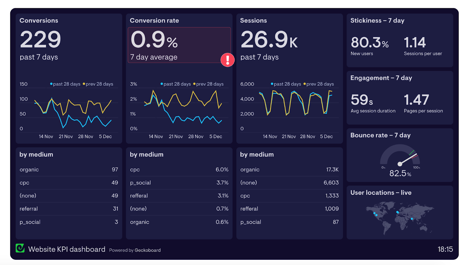
Image: Geckoboard
By analyzing this data, you should be able to get a sense of the overall health of your website and identify specific strengths and weaknesses.
In the dashboard above, for instance, the average 7-day conversion rate is only 0.9%, which is lower than average.
Therefore, the data would show that adjustments need to be made, and you would further comb through the analytics to pinpoint potential issues.
Wrapping Up
At the end of the day, a marketing dashboard simply condenses your analytics data into one convenient place and provides a visual overview of KPIs.
That way, at a glance, you can monitor campaign performance and gain objective insights to improve the customer journey, resolve issues, and improve your overall marketing effort.
It’s just a matter of following the right marketing analytics techniques, analyzing critical KPIs, and using intuitive marketing dashboard software.


